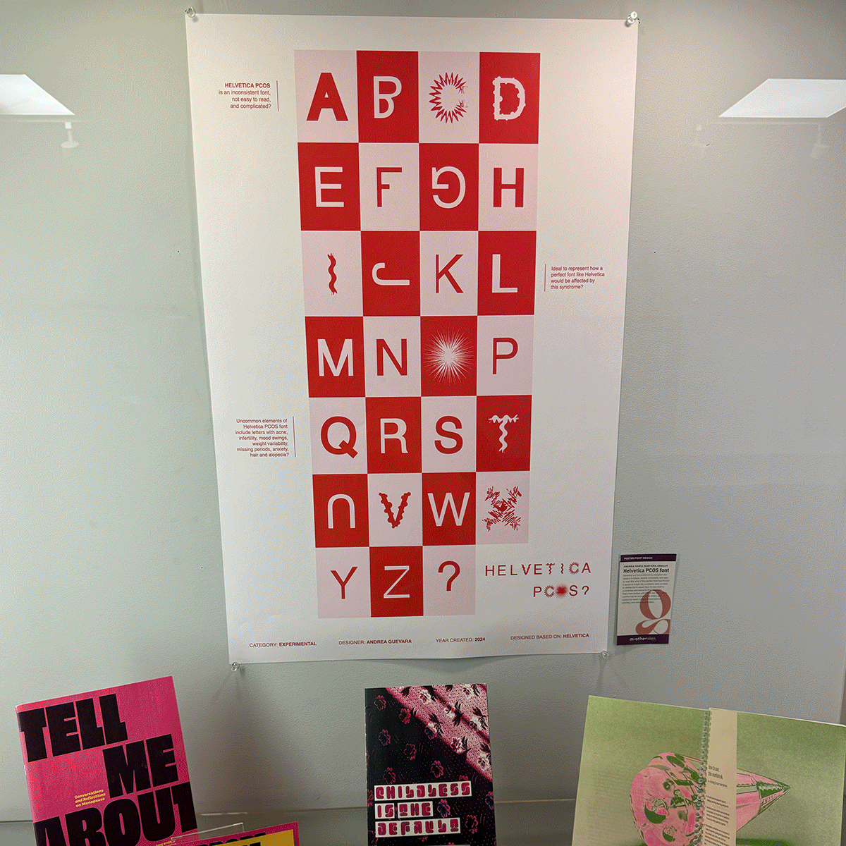
Helvetica PCOS
Categories:
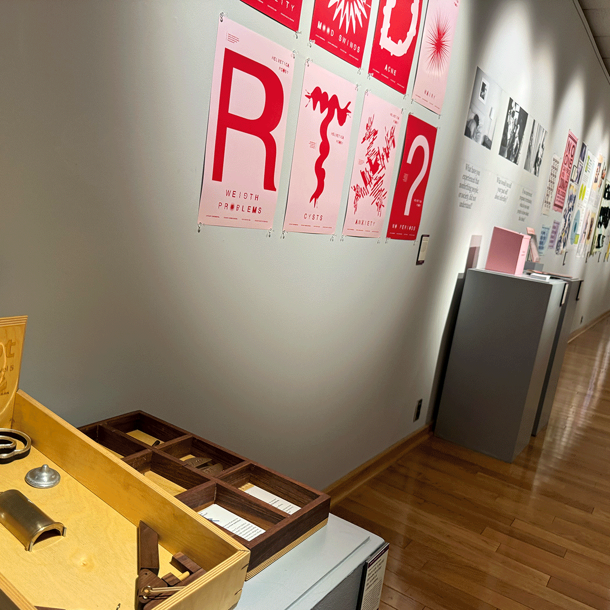
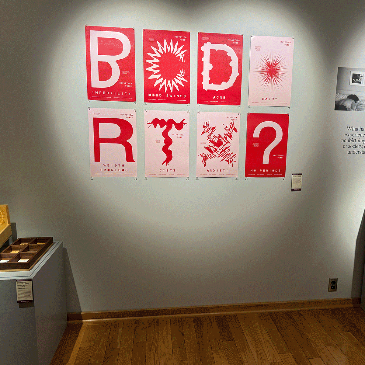
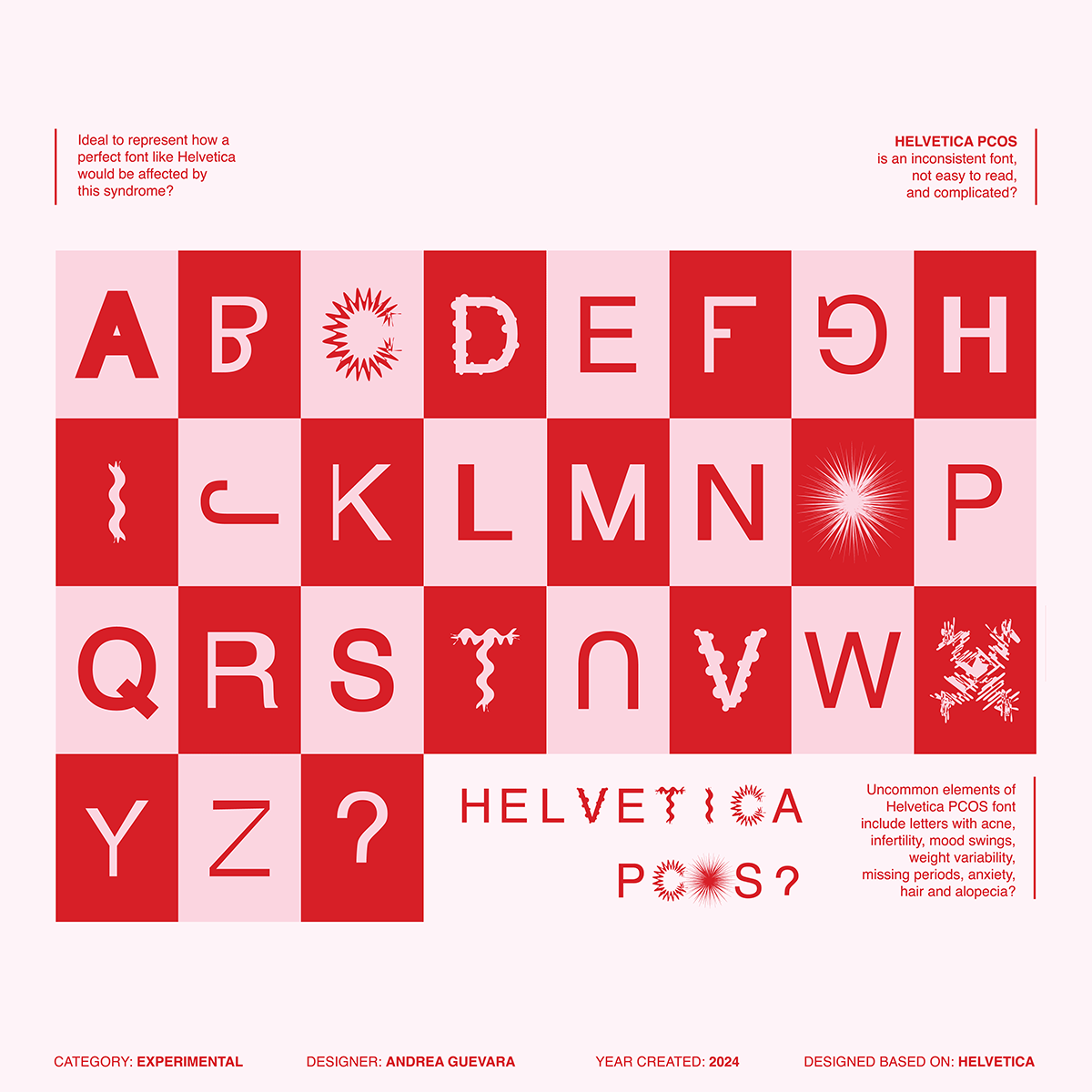
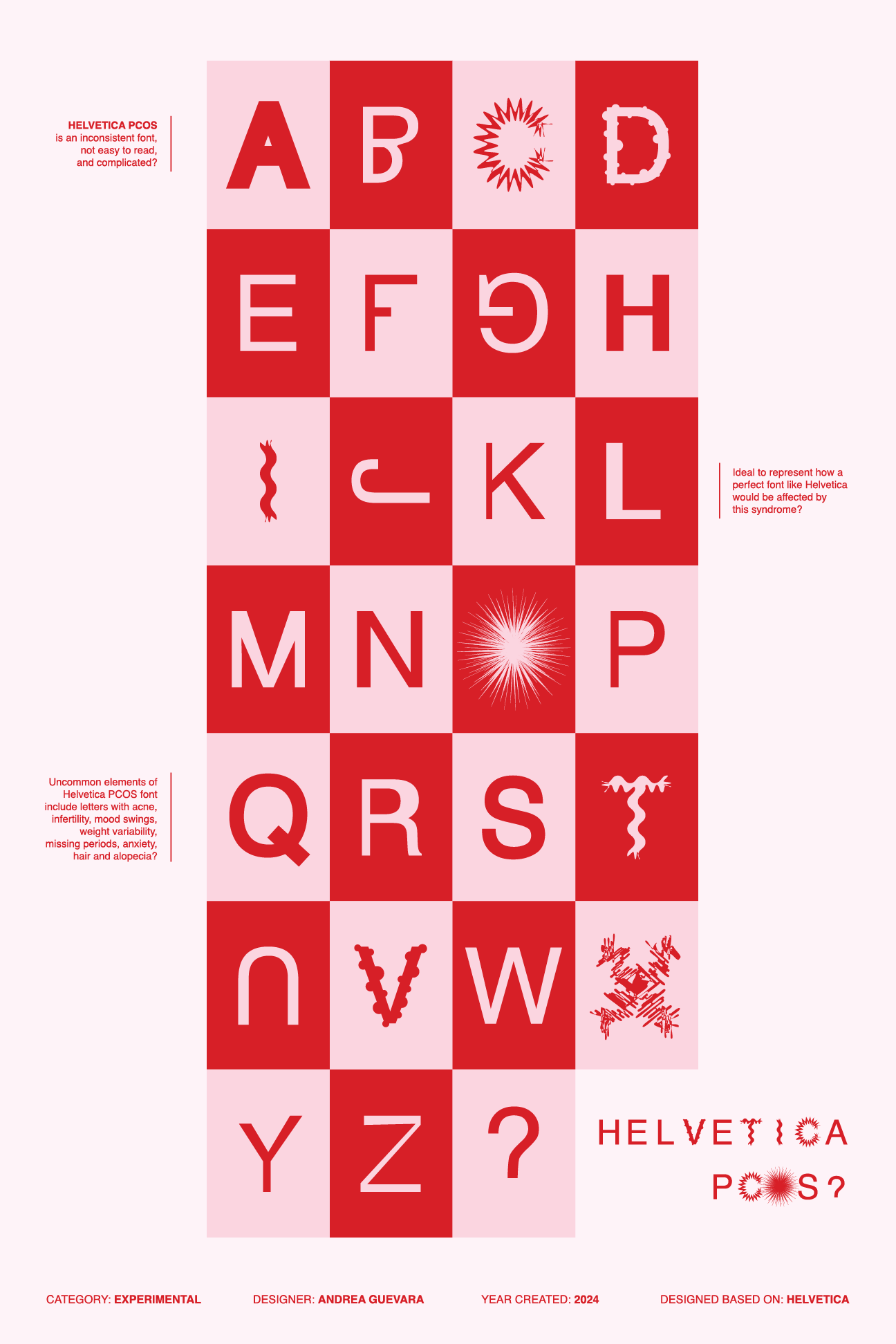
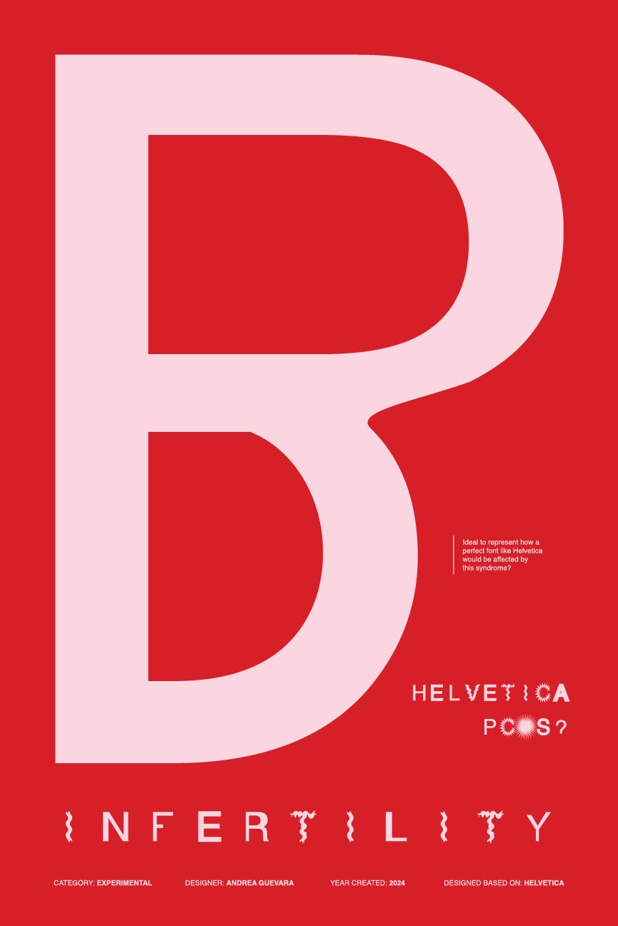
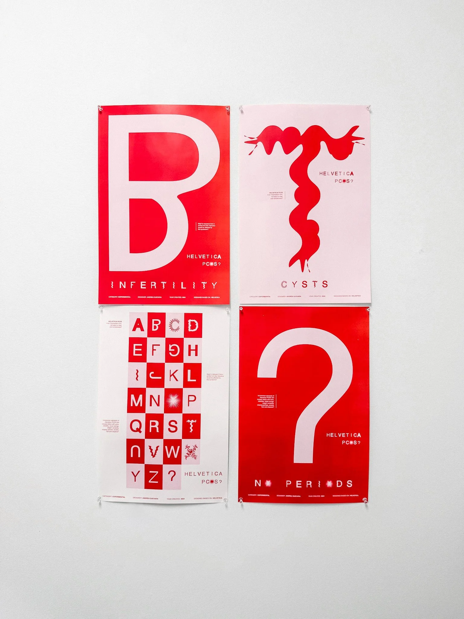
Helvetica PCOS challenges traditional ideals of “perfection” in typography by reimagining Helvetica through the lived experiences of women with Polycystic Ovary Syndrome (PCOS). Helvetica is known for being a simple and consistent typeface, but what if this seemingly perfect font had PCOS?
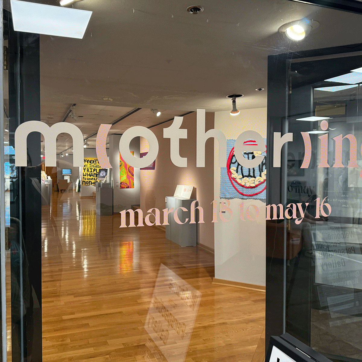
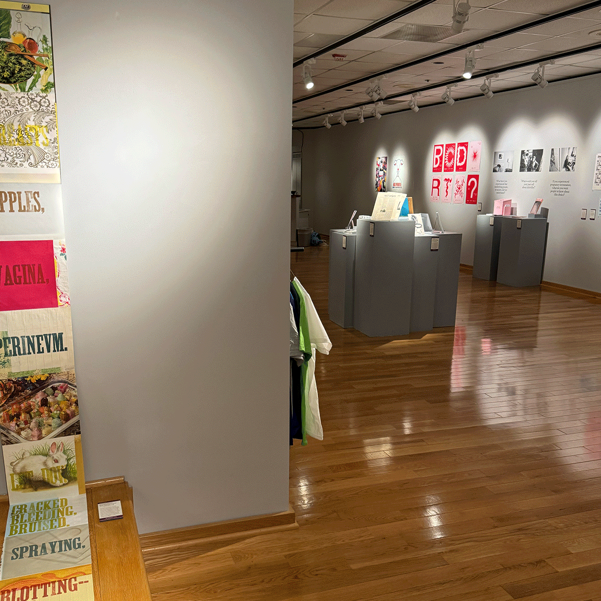
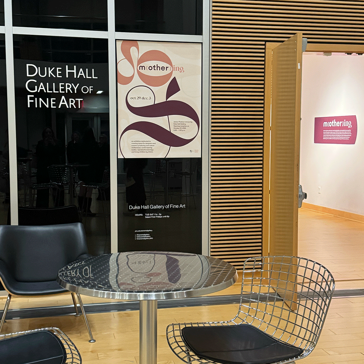
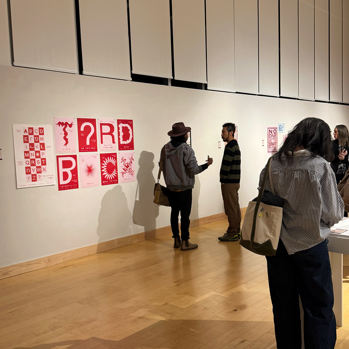
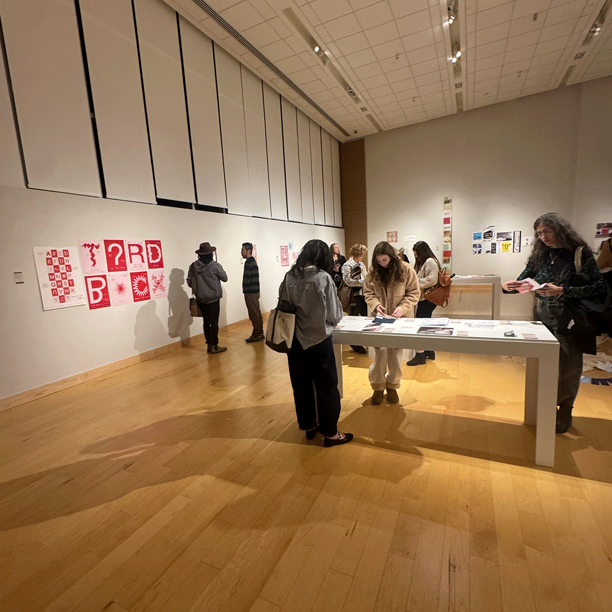
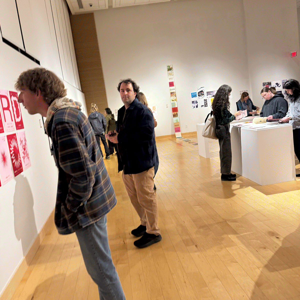
The project was exhibited in the m(other)ing show at Virginia Tech and at the Duke Hall Gallery at James Madison University.
Role: Lead Designer
Technique: Digital/Print Design
-
According to the Endocrine Society, an estimated 5 to 6 million women in the U.S. have PCOS, yet their experiences are rarely represented visually, let alone typographically.
This project asks:
How can typography spark conversation?
How can design generate questions about something so many are living with, yet no one is talking about? -
Typography and PCOS feel like two different worlds, yet when they meet, they create an experimental visual dialogue that pushes against ideals of perfection. By altering Helvetica through distortion, disruption, and imperfect forms, the projects seeks to:
Make invisible experiences visible
Create a typographic system that mirrors the emotional and physical realities of PCOS.
-
Rather than forcing Helvetica to remain “perfect,” the process embraced disruption as a form of truth-telling. I began by studying how PCOS affects daily life. It’s unpredictability, hormonal shifts, emotional waves, and the ways it quietly alters a woman’s relationship with her own body.
These experiences became design prompts.


RESULT:
The final typographic series transforms Helvetica into a living system: one that refuses neutrality and instead speaks with vulnerability and complexity. The typeface no longer performs perfection; it reveals what it means to live inside a body shaped by PCOS.
The project was showcased in the m(other)ing Exhibition at Virginia Tech and the Duke Hall Gallery at James Madison University, where it opened conversations around women’s health, identity, and design.
-
This project allowed me to change my design process. From the start, I wasn’t thinking about creating a solution, but an opportunity to visually communicate a problem. Its conceptual depth shaped not only my approach to typography but also my approach to teaching. I later developed a student project inspired by this exploration—challenging students to design typographic systems rooted in their personal, social, cultural, or health-related experiences.
Exhibition
-
![]()
Virginia Tech
-
![]()
Virginia Tech
-
![]()
Virginia Tech
-
![]()
Virginia Tech
-
![]()
Virginia Tech
-
![]()
Duke Hall Gallery
-
![]()
Duke Hall Gallery
-
![]()
Duke Hall Gallery
-
![]()
Duke Hall Gallery