Game Brothers Store
Client: Game Brothers Store (Mario)
Role: Art Direction, Brand Design, Social Media Strategy & Copy
Collaborator:Julio Chavez (Web Development)
Timeline: 2 months
Tools: Adobe Illustrator, Figma
After five years in the gaming market and partnerships with Nintendo and PlayStation, Game Brothers Store had outgrown its brand. The original logo felt generic and busy — built for early-stage visibility, not for a business ready to scale. But the deeper problem wasn't just visual.
Mario's website had been built by a friend using custom code. It looked fine, but Mario couldn't edit it. He couldn't update products, run promotions, or make simple edits without going back to the developer. For a store with an extensive catalog of licensed gaming products, that dependency was a real business constraint. He didn't just need a new look, he needed his independence back.
The brief that came out of our first coffee shop meeting was clear: something more modern, more personal, more unique than the competition, and built for a fully digital business. And practically speaking — single ink. In El Salvador, printing costs multiply with every color, so the new brand had to work beautifully in one.
The Approach
I led the brand direction end-to-end alongside web developer Julio Chavez, who rebuilt the site in editable code while I handled everything visual and strategic.
The logo refresh kept the brand recognizable while adding depth — a gradient version for digital and a clean single-color version for print, giving Mario flexibility without extra cost.
Before
After
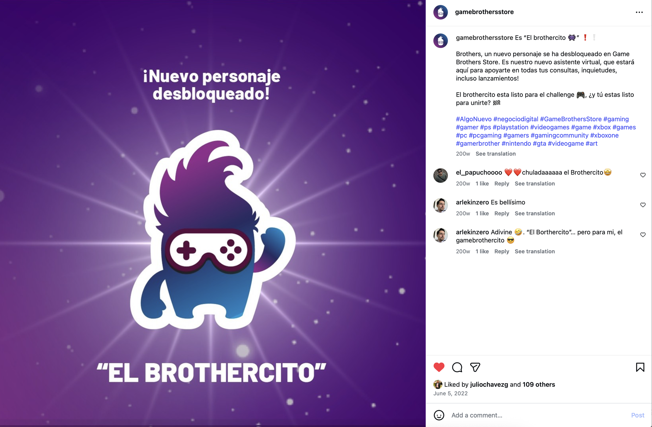
El Brothercito was the idea I'm most proud of. For an online-only store, there's no physical person greeting customers. I designed a character to fill that role. The character was built around Mario himself: his signature hair, his glasses, his personality. I named him "El Brothercito" because in El Salvador we speak in diminutives as a form of affection (it's small, warm, and culturally ours). El Brothercito became the brand's friendly face on social media and the virtual assistant guiding customers through the shopping experience.

PRIMARY LOGO
CHARACTER
SECONDARY LOGO
Mario wanted to mantain a similar color palette, so I refreshed the colors, making them pop a little more. I added a gradient for depth and dimension while keeping it versatile in single-color formats. To enhance engagement, I introduced "El Brothercito," a mascot that serves as the brand’s friendly face on social media and customer support assistant. Additionally, I incorporated a QR-coded logo linking to the e-commerce site, making it easier for customers to browse and order gaming products seamlessly (In El Salvador, e-commerce education is still growing, so I embedded a QR code directly into the logo, linking customers straight to the store).
The Website
It was designed to be intuitive, modern, and fully manageable by Mario from day one! With clear navigation for new launches, sales, and the STAR BROTHER loyalty program. The result is a platform that feels intuitive and engaging, making the transition effortless for loyal customers while attracting new ones.

The social media launch
It was designed like a game reveal! Timed drops throughout a single day to build suspense and drive engagement:
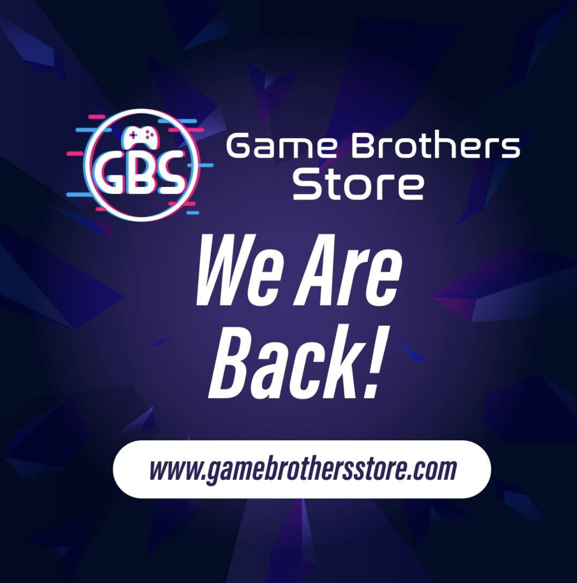
8:00 AM — "We Are Back" teaser, brand departure announced
11:00 AM — "New character unlocked" (Pokemon language), “something new is coming”
12:00 PM — El Brothercito revealed
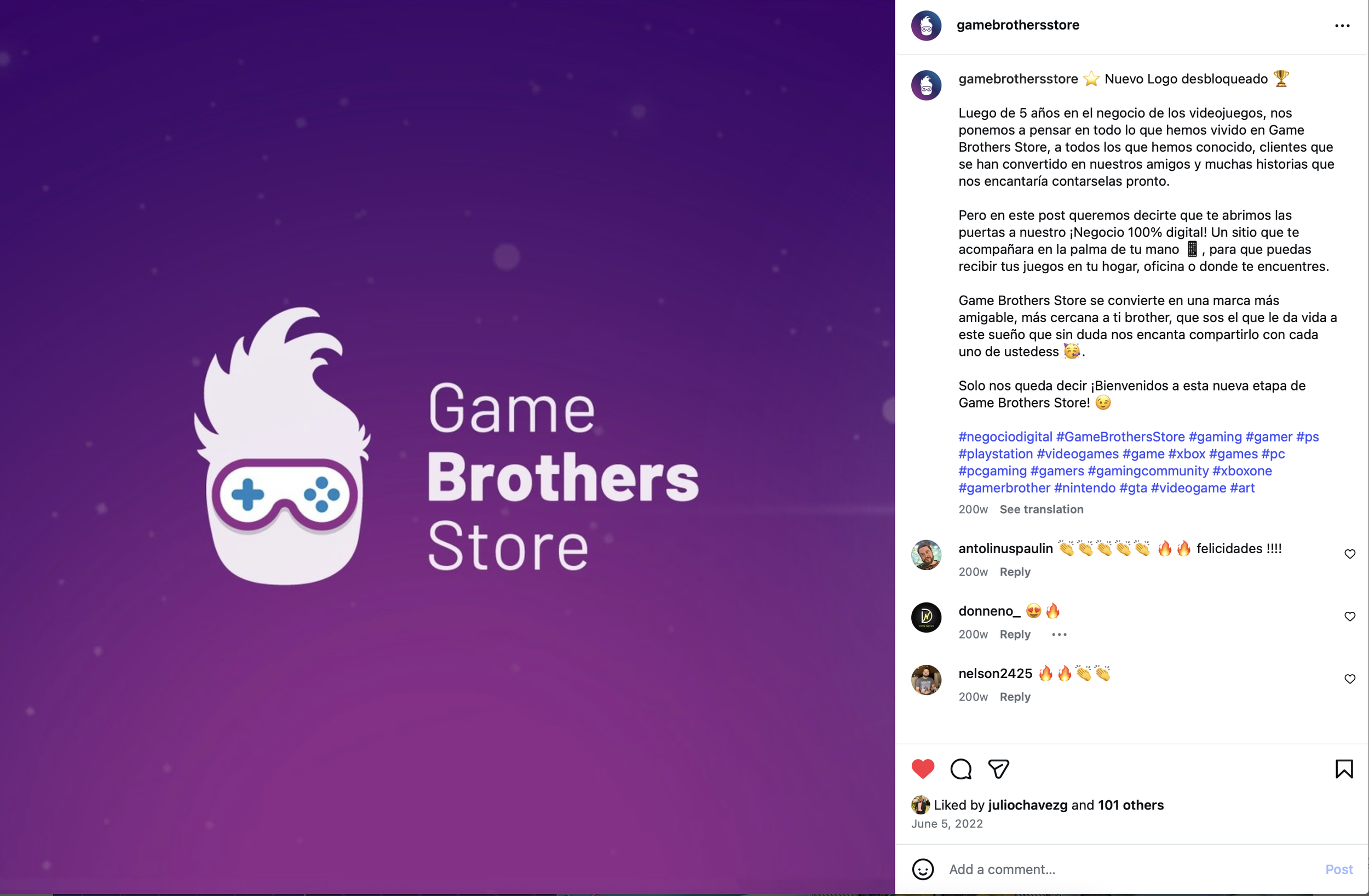
3:00 PM — New logo launched
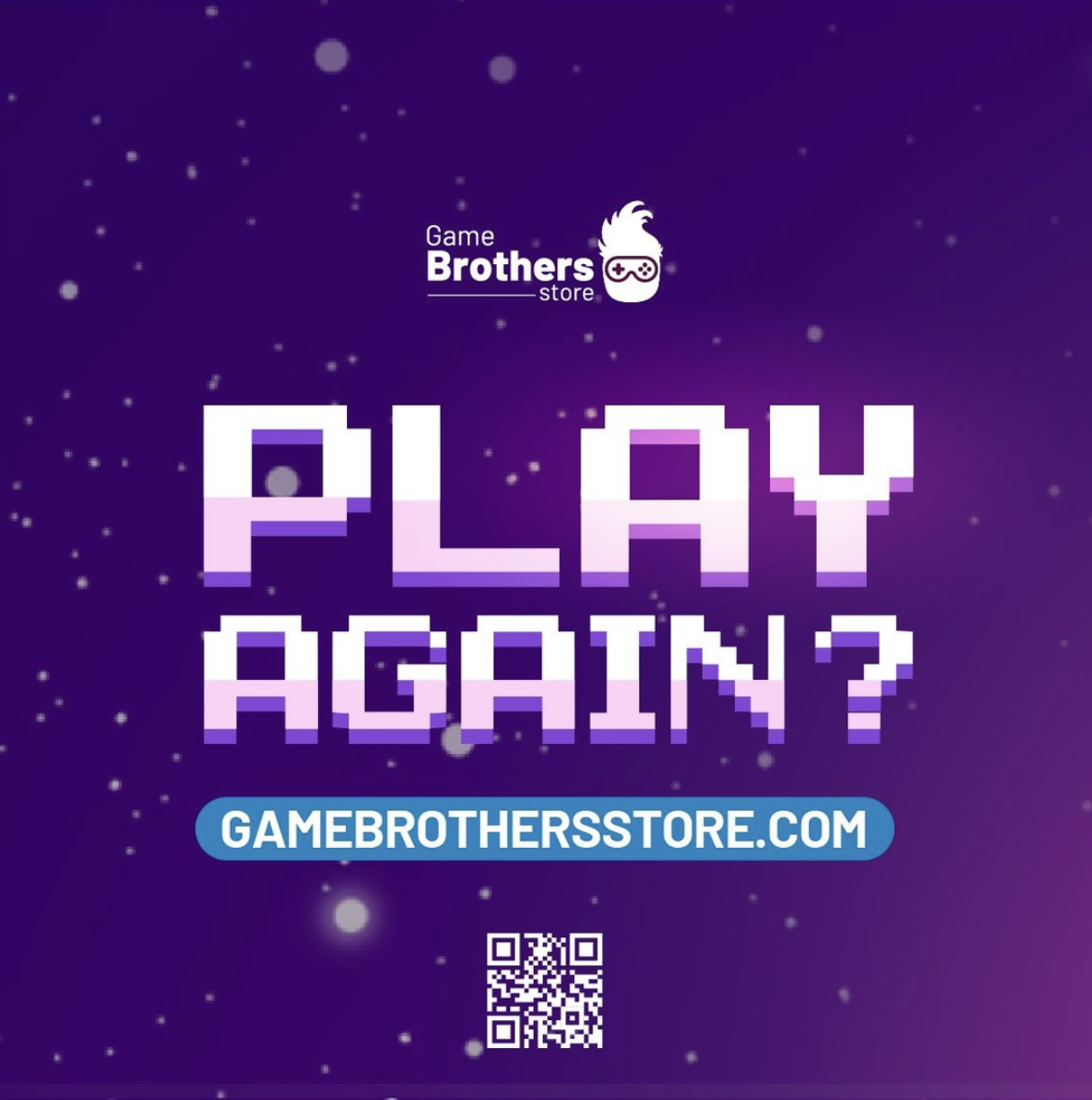
6:00 PM — "Play Again?" — invitation to visit the new website
I wrote every caption myself, studying Mario's voice and combining it with engagement-driven marketing strategy to make it feel authentic — not like an agency, like him.


The challenge was to balance a modern, friendly, and professional aesthetic while maintaining clear messaging and a seamless experience for Game Brothers’ existing community and New Brothers!.

RESULTS:
The rebrand landed. The logo reveal post earned 101+ likes and immediate community celebration. El Brothercito's reveal generated 109+ likes with comments calling it "bellísimo" — beautiful — and the community immediately making him their own.
But the result that mattered most to Mario was simpler: he got his freedom back. For the first time, he could update his store, add products, and run his business without depending on anyone. That ownership was the whole point.
The website ran for three years and is still live today — Mario eventually updated it to an even more modern version, which is exactly what a well-built foundation allows you to do.
-
This project taught me that brand design is rarely just about aesthetics. The real design problem here was independence. We gave the business owner the tools and visual identity to grow on his own terms. El Brothercito was the part that surprised me most: a character born from one person's hair and glasses became the heartbeat of an entire brand strategy. Sometimes the best creative decisions come from simply paying attention to who you're designing for.